

Guide
Amenity packaging that photographs well for listings and social
Amenity packaging photographs well when it has a simple shape, a matt or soft finish, a calm colour that suits the bathroom and a label that is readable at small size. In listing and social photos the bottle is a small part of the frame, so clarity and harmony matter more than detail.
By Hemang Jain, Founder, Anadoris
Why packaging matters in photographs
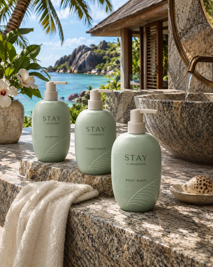
For small hotels, homestays and short-stay hosts, the listing photograph is often the first meeting with a guest. A bathroom shot with tidy, matching bottles suggests a well-kept property; mismatched supermarket packs suggest the opposite. On social media, guests photograph what looks good, and a pleasing bottle on a stone basin can travel further than any advertisement you pay for.
Packaging is also one of the few things in a bathroom photograph you can change easily. Tiles and fittings are fixed; bottles are not.
What makes a bottle photogenic?
- Simple silhouette: a clean cylinder or soft rectangle reads clearly even when small in the frame.
- Matt or soft-touch finish: reduces glare from bathroom lights and camera flash.
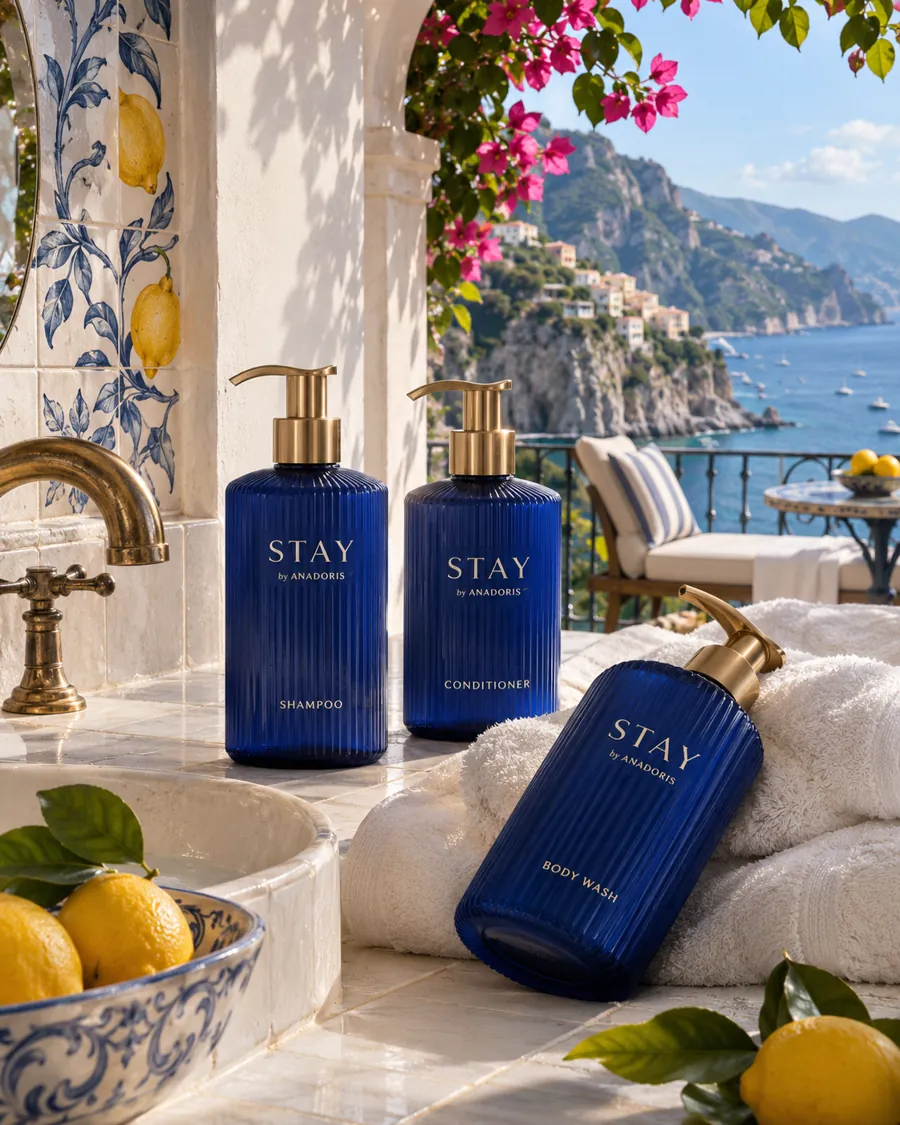
- Calm colour: white, stone, amber, deep green or charcoal sit well against most tiles.
- Readable label: a short name in a clear typeface, with generous space around it.
- Matching set: the same shape and colour across shampoo, conditioner and body wash.
Packaging choices compared for photographs
This table compares common packaging choices by how they tend to appear in photographs and in daily use.
| Choice | In photographs | In daily use |
|---|---|---|
| Glossy clear plastic | Shows reflections and the level of liquid | Fingerprints and drips show quickly |
| Matt opaque plastic | Even, calm, little glare | Hides fill level and minor marks |
| Amber or tinted bottle | Warm, apothecary feel | Fill level visible but softened |
| Ceramic-look dispenser | Looks considered and permanent | Needs a stable surface or bracket |
| Busy, colourful label | Distracts from the room | Can look dated quickly |
Match the packaging to the bathroom
Look at your bathroom photographs before choosing. White bottles disappear against white tiles, which can look clean or bland depending on the room. Dark bottles stand out against pale stone but may look heavy in a small shower. Wood and brass fittings suit amber, cream or deep green; concrete and black fittings suit white or charcoal. Our guide on matching dispenser finishes covers the same thinking for wall units.
How to stage the shot
- Clean the bottles and wipe away drips; the camera sees everything.
- Turn every label to face the camera at the same angle.
- Group the set on a tray or shelf rather than scattering it.
- Use daylight where possible and switch off harsh overhead lights.
- Add one natural element, such as a folded towel or a plant, and nothing more.
- Take one close shot of the set and one wider shot of the whole bathroom.
Should your name be on the bottle?
A property name on the bottle helps when guests share photographs, because the image carries your name with it. But a well-designed unbranded set looks better than a poorly branded one. If branding is not yet practical, choose a ready-made collection with a clean design and add your name later on the products guests see most. Our guide on branded amenities for small properties explains the routes.
Practical points that also affect the look
A beautiful bottle that is hard to use soon looks untidy. Choose pumps that do not drip, caps that close cleanly and labels that survive wet hands without peeling. Ask whether labels are printed directly or applied, and how they hold up in steam. For packaging styles across formats, see the collections, and request samples to photograph them in your own bathroom before you buy.
Questions on this topic
What colour bottles look best in bathroom photos?
It depends on the tiles. White, stone, amber, deep green and charcoal suit most bathrooms; choose the one that contrasts gently with your surfaces.
Do matt bottles really look better on camera?
Generally yes. Matt finishes reflect less light, so they look even under bathroom lights and flash.
Should I photograph the amenities for my listing?
Yes. One close shot of a tidy set tells guests what to expect and signals that the property is well kept.
Keep reading
- What are the best bathroom amenities for a boutique hotel?
- What should a B&B provide in guest bathrooms?
- What do Airbnb guests expect to find in the bathroom?
- Dispensers or miniatures for a small property: how to choose
- How to stock an Airbnb bathroom
- Hospital and clinic bathroom amenities: what to consider
- Gym locker room amenities: a practical checklist
Looking for supply? See Hotels & resorts, browse the product range or request samples.